All Copywriters will tell you a similar story. From when they were young, they noticed silly little mistakes in ads. Whether they’re TV ads, radio ads, or billboards (okay, ESPECIALLY billboard ads!) For me, nothing has changed. In fact, it’s gotten worse. While I appreciate a good advert, the bad ones irk me. And it’s not only adverts themselves. It’s the WAY companies market themselves.
- Still handing out pamphlets? Seriously?
This probably happens everywhere, but in South Africa it is falsely believed to be the main way of advertising. Handing out flyers, pamphlets and catalogues is one of the most ineffective ways to market your company. If you’re still doing this, YOU MUST STOP NOW!
New businesses fall into this trap so easily. They see it as cheap, easy and effective. The truth is you are giving your marketing efforts less than a 1% success rate. You are annoying potential customers, wasting paper and making yourself look desperate. Again: STOP NOW!
- The ‘WE-OUR-US’ mistake
Another big mistake I often see (and notice straight way) is the use of “We” or “Our” at the beginning of a sentence. Do you really think the customer cares about you or your team? No! An advert is not an interview. It’s a message telling people that they can benefit; they are missing out; they will enjoy something…
A good ad always starts with the words, “You” and “Your”. If it’s not possible to start with these words, at least use words that won’t make the reader instantly lose interest.
- Failure to adequately grab attention
These are the factors that can win or lose your customer in the first few seconds. An unfriendly face handing you a pamphlet. And the pamphlet is all about YOU—instead of the customer. No way, you haven’t got a chance…
Grab that customer’s attention. Speak to him/her. Ask them questions. Bombard them with benefits. Be relevant. Be exciting. This is what real copywriting can bring to your adverts!
- Colour confusion
Colours can often speak louder than words. Companies are using colours they think are either nice or relevant to their business. Again, it’s not about you. It’s about the customer. The colour you use is subconsciously telling your customer something about what they are getting if they bite. An insurance company that uses orange or purple? Facepalm!
- Too much emphasis on the name
Companies in South Africa have a tendency to place their name right above the advert. We see this on billboards, street pole ads and trailer posters all the time. The customers are actually surprisingly disinterested in your name. All they really want to know is what you can offer them.
While branding is important, always place your company name at the bottom of the advert. If you catch their attention and entice them, they’ll look for it eventually.
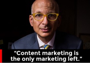
I’ll leave you with the words of Seth Godin. Feel free to contact me if you’d like any more info on how to make your ads stand out from the rest.


